(Case study 01)Insomniac Festival App

Lost in
the lights.

UX Research &
Usability Evaluation

I investigated how festival-goers navigate, plan, coordinate, and recover when the Insomniac app meets the time pressure and connectivity constraints of a live event.

RoleUX Researcher
MethodsSemi-structured interviews
Task-based evaluation
Participants8 festival-goers
Session length30 minutes
(01)The challenge

Usability changes
when the crowd
closes in.

At a festival, finding a restroom, comparing overlapping sets, or reconnecting with friends can become an urgent decision—not a leisurely browse.

The study examined how information density, navigation structure, group coordination, and unreliable connectivity shaped participants’ ability to use the app. Interviews were conducted remotely, so the research speaks to recalled festival behavior and task responses—not direct in-context observation.

(02)Research question
How might the Insomniac app support clearer, more confident decisions across navigation, set-time planning, and group coordination?
01

Understand how festival-goers find and interpret set times, maps, and artist information.

02

Locate moments of confusion and cognitive friction across core planning tasks.

03

Understand why people leave the app for screenshots, notes, Instagram, or EDMTrain.

04

Translate observed pain points into clearer, more reliable planning experiences.

(03)Research approach

Evidence before
interface opinion.

The completed study combined 30-minute semi-structured interviews with task-based evaluation of lineup, set-time, map, and artist-recognition stimuli.

01

Recruit

Personal networks; experienced EDM festival attendees

02

Interview

Festival habits, planning, navigation, reliability

03

Evaluate

Lineup, grid, map, and DJ-recognition tasks

04

Synthesize

Patterns grouped into four research themes

05

Recommend

Evidence translated into product directions

(04)Participants
Completed study
8participants
18–32age range
Screener snapshot
75%attended 5+ festivals
87.5%had used the app multiple times

The study plan proposed 10 sessions. The completed presentation verifies 8 participants, ages 18–32. The 75% and 87.5% figures come from a separate eight-response screener export and are not presented as completed-sample characteristics.

(05)What I evaluated
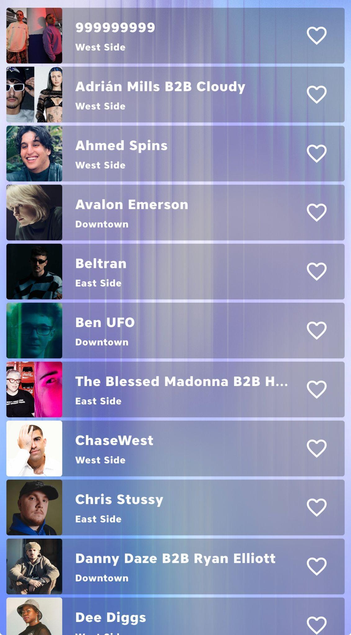
Insomniac app lineup view used as research stimulus
Lineup discovery Scanning, hierarchy, sorting
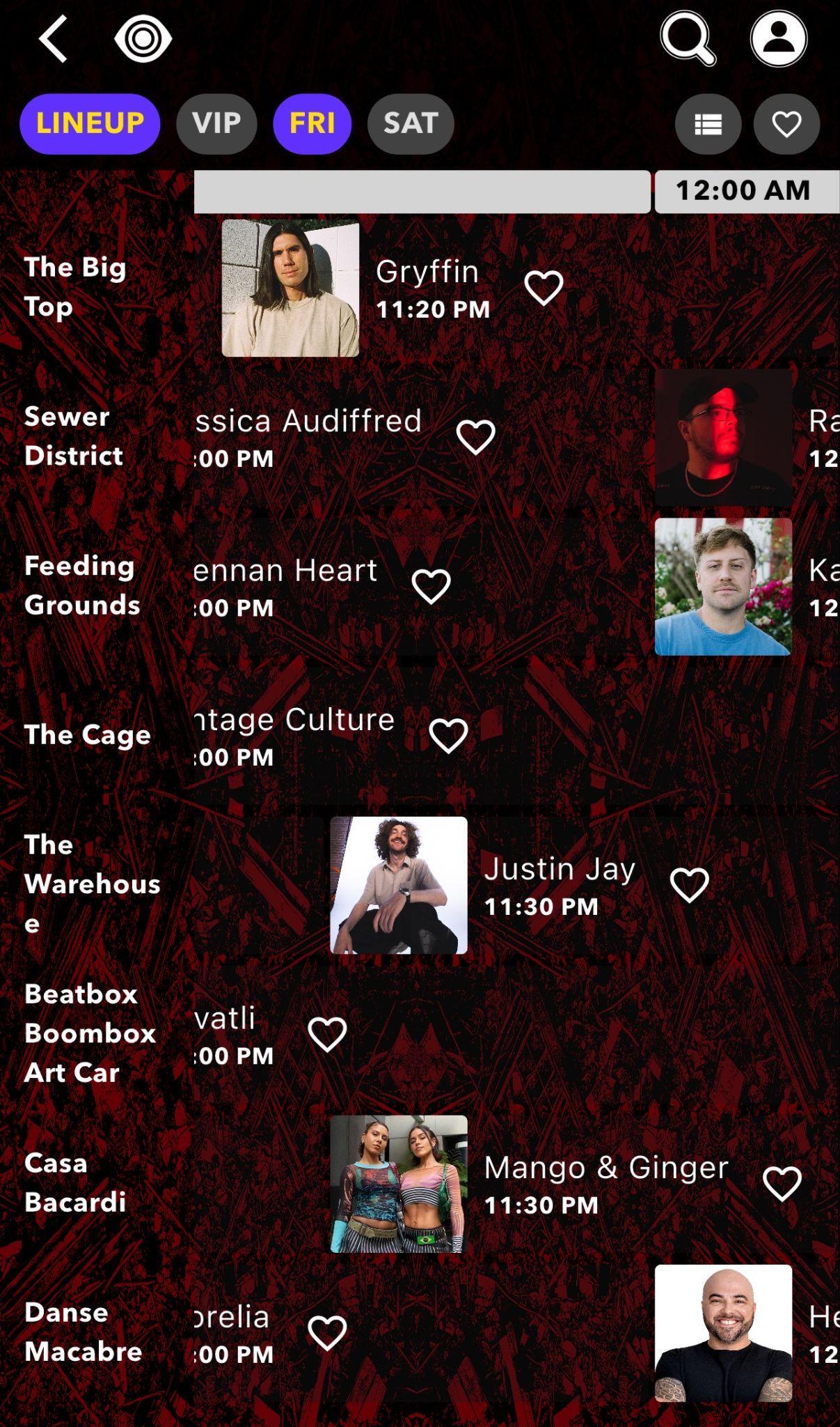
Insomniac app set-time grid used as research stimulus
Set-time planning Comparison, overlaps, orientation
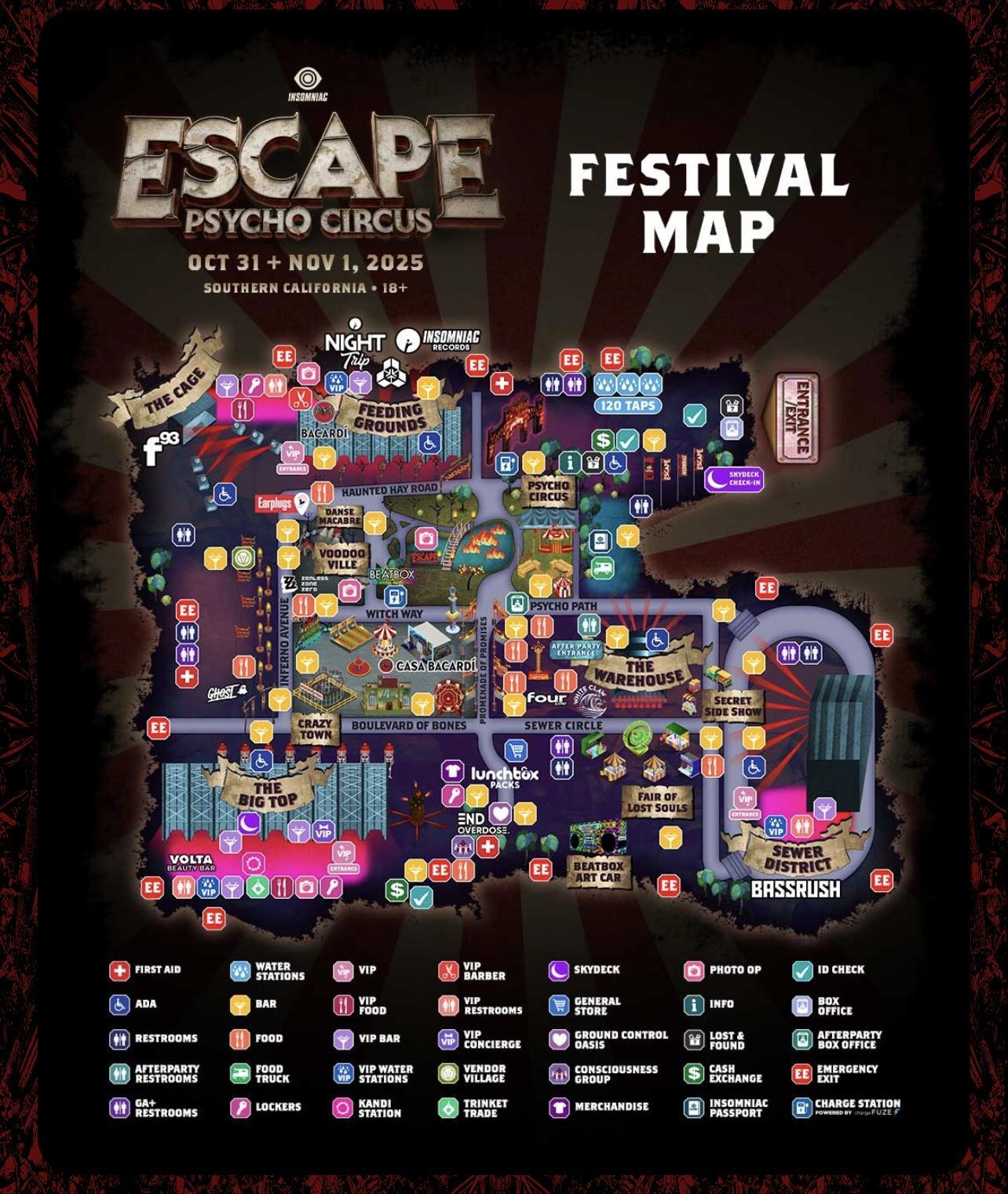
Escape festival map used as research stimulus
Festival navigation Resources, density, wayfinding
(06)Analysis

From moments
to patterns.

Interview responses and task feedback were synthesized into 20 insights across four themes. The final presentation paired recurring comments and reported behaviors with product recommendations.

01Interview
02Evaluate
03Review
04Group
05Theme
06Recommend
Navigation & map usabilityLineup & set-time comparisonPersonal & group planningOffline access & reliability
(07)Key findings

Four frictions shaped
the festival experience.

Selected from the final presentation’s highest-frequency and highest-impact findings.

(01)

Horizontal scrolling broke set-time planning.

Evidence

All 8 participants preferred a vertical time axis. Participants described losing earlier information, taking too many screenshots, and wanting time to flow from top to bottom.

Why it matters

The grid’s orientation increased memory demands precisely when users needed to compare stages and spot conflicts quickly.

(02)

Group planning happened through inconsistent screenshots.

Evidence

All 8 participants described screenshot-based coordination as confusing or painful. Different crops and formats made group decisions difficult to reconcile.

Why it matters

A personal schedule became a fragmented group artifact instead of a shared source of truth.

(03)

On-site reliability had eroded trust in the app.

Evidence

7 of 8 participants reported on-site loading failures or crashes; a separate 7 of 8 expressed demand for offline mode. Participants prepared screenshots, notes, or memorized schedules before arriving.

Why it matters

When connectivity dropped, the product could not reliably support the moments when its information was most valuable.

(04)

The map made essential resources hard to find quickly.

Evidence

In separate findings, 6 of 8 participants described the map as overcrowded and 6 of 8 wanted search or filter tools for toilets, exits, water, first aid, and stages.

Why it matters

Decorative density and low contrast competed with urgent wayfinding needs.

(08)Recommendations

Research,
translated.

Each direction follows the logic in the final presentation: observed friction, synthesized insight, then recommended product response.

01
Observation

Horizontal scrolling broke set-time planning.

Insight

The grid’s orientation increased memory demands precisely when users needed to compare stages and spot conflicts quickly.

Design direction

Reorient the schedule to Time = Y and Stage = X, add a sticky time column, and offer a denser view.

02
Observation

Group planning happened through inconsistent screenshots.

Insight

A personal schedule became a fragmented group artifact instead of a shared source of truth.

Design direction

Introduce collaborative planning with invitations, co-editing, and one unified group timeline.

03
Observation

On-site reliability had eroded trust in the app.

Insight

When connectivity dropped, the product could not reliably support the moments when its information was most valuable.

Design direction

Pre-cache maps and set times, add a low-connectivity mode, and make offline status explicit.

04
Observation

The map made essential resources hard to find quickly.

Insight

Decorative density and low contrast competed with urgent wayfinding needs.

Design direction

Simplify the visual system, strengthen contrast, and add searchable, filterable priority maps.

(09)Research-informed concepts
Conceptual · Not validatedSet-time grid

Vertical time axis

Time runs top to bottom, stages run across, conflicts are highlighted, and orientation remains visible while scrolling.

Conceptual · Not validatedGroup planning

Shared festival timeline

Friends can invite, co-edit, and view one group plan instead of reconciling inconsistent screenshots.

Conceptual · Not validatedOffline reliability

Download “My Day”

Essential maps and set times are cached before entry, with clear offline status and filtering that still works.

Proposed experience directions—not shipped or post-design validated. The supplied materials contain recommendations but no final redesign mockups.

(10)Outcome & reflection

Context is not
background.
It is the brief.

The research produced 20 documented insights across navigation, planning, coordination, and reliability, plus a set of evidence-linked product recommendations.

This project reinforced the value of looking beyond stated preference to the workarounds people build when a product fails them. It also showed where stronger field research is needed: future work should observe behavior inside a live festival and validate proposed solutions with a broader sample.